Building footprints at a global scale
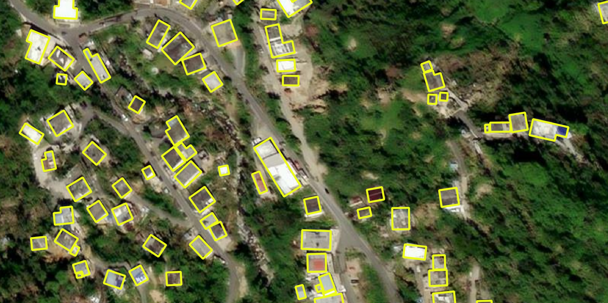
Often the pace of urbanisation is faster than the capacity that mapping instruments/agencies have to keep an updated record of urban expansion and growth. Following the previous release of building footprints across different areas of the world 1, a repository of 777M building footprints has been published in a GitHub repository organised by country 2. The purpose of this exercise is to visualise some of this data to assess its quality which could inform possible research scenarios. I looked at a sample of the more than 6 million polygons available for Chile, more specifically I mapped central and peripheral areas of Santiago on an interactive map to ease exploration.
6 million polygons
While the zipped file for Chile is ~500 MB, the unzipped version is a GeoJSON file of more than 2 GB. To facilitate handling these large amount of data I decided to set up and use a spatial database and query it using SQL. All the processing was conducted in RStudio supported by the packages sf, DBI, and RPostgres.
Code
knitr::opts_chunk$set(echo = TRUE, message = FALSE, warning = FALSE, fig.path="img/", dpi =100)
library(tidyverse)
library(sf)
library(ggplot2)
library(ggthemes)
# install.packages("DBI", "RPostgres", "Chilemapas")
library(DBI)
#install.packages("RPostgres")
library(RPostgres)
#install.packages("chilemapas")
library(chilemapas)
library(leaflet)
#install.packages(c("leafgl", "leaflet.extras", "htmlwidgets"))
library(leafgl)
library(leaflet.extras)
library(htmlwidgets)Visualising footprints
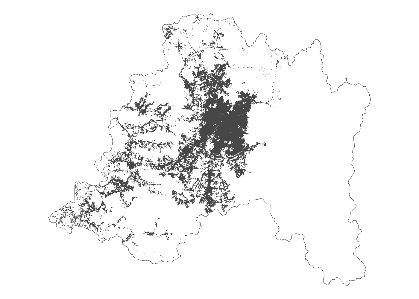
In order to have a close inspection of the correspondence between the vector building polygons and standard satellite imagery I decided to create an interactive map using leaflet. The three areas selected for inspection are shown in the map below covering the North, Centre and South of Santiago. The North periphery (Colina) is known for the presence of affluent suburban single-family houses organised in gated communities. The centre (Santiago) is still considered the civic centre of the capital. The South periphery (La Pintana) is an area of high density of social housing that will be radically transformed by the forthcoming construction of a Metro line.
Code
# chilemapas
mapa_comunas %>%
st_as_sf() %>%
st_set_crs("EPSG:4326") -> cl_comunas
cl_comunas %>%
filter(codigo_region == "13") %>%
ggplot() +
geom_sf(fill = NA, col = "grey", lwd = 0.4) +
geom_sf(data = scl_s, col = "tomato", fill = NA) +
geom_sf_label(data = scl_s, aes(label = name), size = 2.5, alpha=0.5, vjust = 0.5, hjust = 0, nudge_x = 0.03) +
theme_void() +
theme(panel.background = element_rect(fill = "transparent", colour = NA),
plot.background = element_rect(fill = "transparent", colour = NA))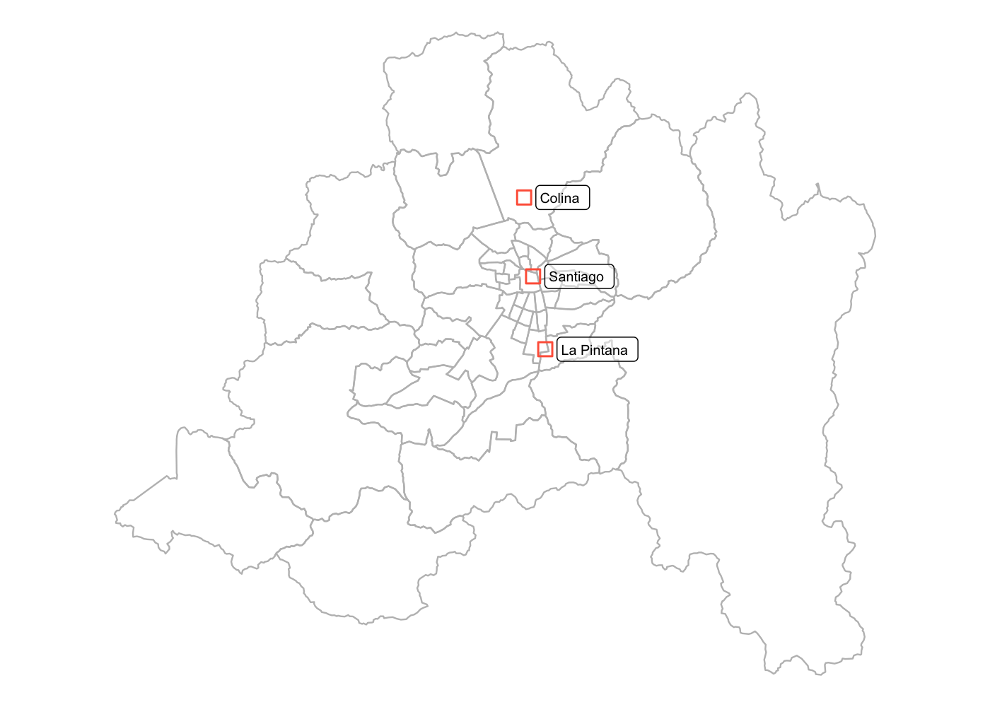
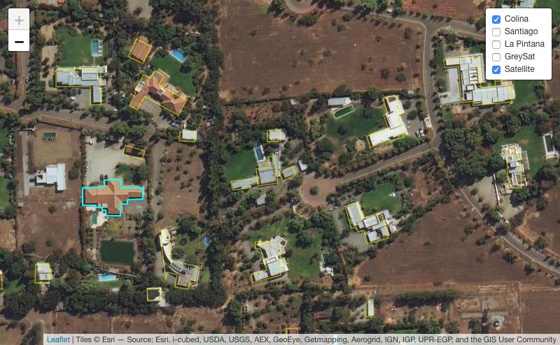
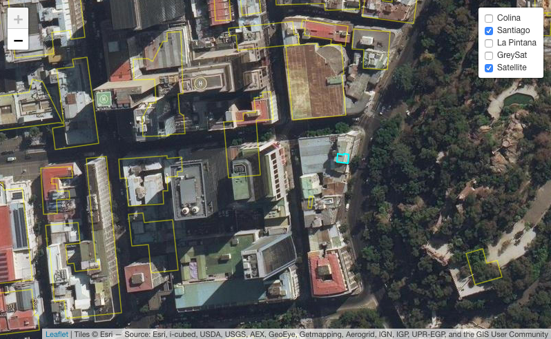
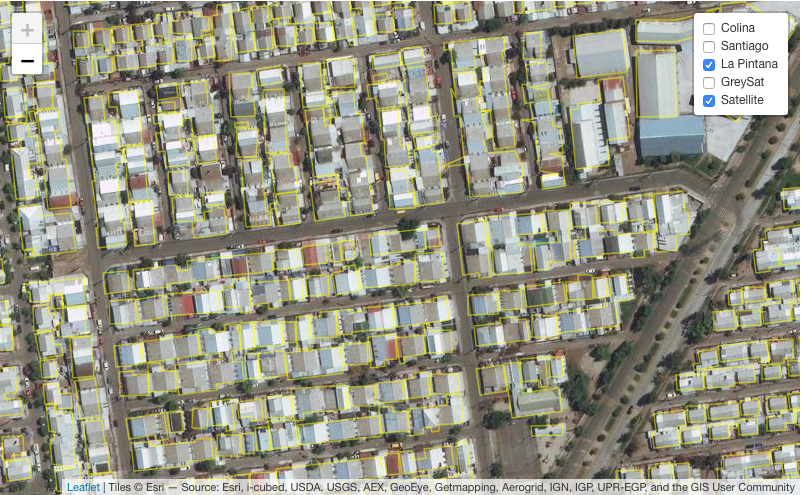
The interactive map allows to compare the building outlines against satellite imagery available as a basemap. It can be observed that the AI mapping is quite good at detecting building footprints in the North and South periphery. However, in the presence of buildings that are in high proximity (La Pintana in the South), the outline drawn often does not differentiate between units. Meanwhile, at the centre where there are plenty of high-rises and more complex buildings the outlines are occasionally absent or draw strange shapes. As Microsoft states ‘… the vast majority of cases the quality is at least as good as hand digitized buildings in OpenStreetMap. It is not perfect, particularly in dense urban areas but it provides good recall in rural areas’. It could be argued that the contribution of this global mapping effort is valuable, in particular for cartographic-deprived areas. Moreover, like in the case of this exercise, interesting urban density metrics could be computed to compare and describe urban planing and design practice3. For example, it could be expected from the areas visualised in the interactive map, that the difference of open space metrics between affluent and deprived areas would be quite noteworthy.
Footnotes
See Microsoft’s AI Assisted Mapping↩︎
See repository↩︎
See Ground Space Index that describes the amount of built ground in an area, and related work Spacemate↩︎
Citation
BibTeX citation:
@online{palominos2022,
author = {Nicolas Palominos},
title = {Building Footprints from {Bing} {Maps} Imagery},
date = {2022-05},
langid = {en}
}
For attribution, please cite this work as:
Nicolas Palominos. 2022. “Building Footprints from Bing Maps
Imagery.” May 2022.